About the component
Simple GUI package contains pre-created reusable buttons for creation of 2D user graphics interfaces in the 3D digital world.
- Version: 0.3 (30/11/2021)
UI Components:
- Single Button
- Toggle Button (parametric) - the selected number of buttons placed side by side while only one can be highlighted
- Slider (with value)
- Switch button (prev / next)

The component is ready for download
Download the componentRequest custom modificationNot sure how to use it?Documentation
Installation:
- Import downloaded package into "Content" folder of your project. The component will appear in the folder "Content/_VrealmaticLibrary/SimpleGUI". [Video guide]
- You can work right with the imported files or duplicate them anywhere you need within your project
Package sources:
SimpleGUI/Actors
- BP_HUD - example SimpleGUI actor with attached Widget Component (DefaultSceneRoot/Widget). UI widget to be displayed is defined on selected Widget Component → Details/User Interface/Widget Class. You can duplicate it for other UI widgets used in the project.
- BP_SimpleGUI_Controller - logic based blueprint actor inside which you can set what trigger action should go into which SimpleGUI actor as "BP_HUD". It is loaded into a scene automatically by "BP_HUD" like actor, if not placed in the scene already.
- SimpleGUI/Textures = Textures used in buttons
- SimpleGUI/UMG/Reuse = Reusable buttons you can load in widgets
- SimpleGUI/UMG/HUD = Widgets
- SimpleGUI/Enumeration = Enumerations associated with the simple GUI
Enumeration summarizes available options associated with the SimpleGUI.
- Other Enumeration. NOTE: they should be part of a project Dev structure. I have them here only for example purposes (attached widgets) / simple replication.
- SimpleGUI/Structure = Structures associated with the simple GUI
- Struc_ButtonPressedValue - Structure used for passing value of slider component on interaction
UI Buttons are created as reusable. All buttons have attached "W_CoreButton" that triggers events (if there is need to modify anything related triggering, you can do it right in this Widget Blueprint). On event selection they trigger functionality attached inside Widget Blueprint (SimpleGUI/UMG/HUD) via a middleman (e.g. PawnCharacter).
Placing Widget into the scene:
GUI Actor (SimpleGUI/Actor/BP_HUD and similar) can be placed into the scene directly or dynamically. NOTE: Be sure, you have active Hit Result on the widget interaction.
- Direct placement: Simply drag the actor into required place
- Dynamical:
- There is possible to display widget (= place UI Actor [such as BP_HUD]) into the scene from any active Actor placed in the scene (e.g. PawnCharacter) based on any action (e.g. pressed button). Here's a quick example how to make it:
- Inside the actor, create a new variable of the UI Actor type [e.g. BP_HUD].
- On selected trigger (e.g. InputAction), insert / remove (toggle) UI Actor [BP_HUD] into / from the scene
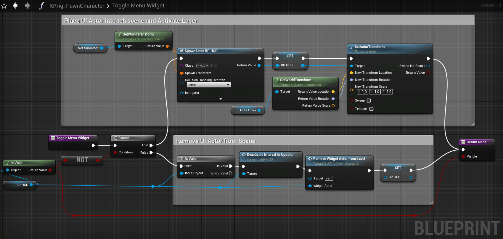
Toggle Widget Example
- There is possible to display widget (= place UI Actor [such as BP_HUD]) into the scene from any active Actor placed in the scene (e.g. PawnCharacter) based on any action (e.g. pressed button). Here's a quick example how to make it:
Creating UI widgets
For better insight, check the video showing this in the practice.
- By default, you start with duplication of pre-created empty widget blueprint "_Wc_HUD_Starter" (located at SimpleGUI/UMG/HUD) and renaming it to your widget name.
- You use standard UMG designer and components during creation. UMG components covers also "reusable buttons" (SimpleGUI/UMG/Reuse) attached in this Simple GUI package.
- Each created widget becomes a new reusable component in your project. You can insert created Widgets into each other, like in the "Wp_UserHUD" example widget.
Reusable package buttons (SimpleGUI/UMG/Reuse) and their options:
- W_BoundedButton (Single Button)
- ButtonAction = button identifier (defined in SimpleGUI/Enumeration/EButtonAction file)
- Buttons Text = Button text
- Button On = highlined button border
- ButtonAction = button identifier (defined in SimpleGUI/Enumeration/EButtonAction file)
- Buttons Text = definition of number of buttons and their text
- SelectedOptionIndex = definition of default selected option of the toggle bar
- W_NumberSlider
- MinValue = minumum value the slider can reach
- MaxValue = maximum value the slider can reach
- CurrentValue = current value of the slider
- StepSize = StepSize (sensitivity) of the slider
- ButtonAction = button identifier (defined in SimpleGUI/Enumeration/EButtonAction file)
- ContinuousUpdate = Slidder triggers action continuously as its value is changed / only once on slider release
- W_SettingsButtonCheckbox
- ButtonAction = button identifier (defined in SimpleGUI/Enumeration/EButtonAction file)
- Buttons Text = Button text
- Button On = highlined button border
- Checked = checked state
- W_ChangeMenuButton
- ButtonRight = is it button right? (=next page)
- W_BoundedButton (Single Button)
Creating logic of UI widgets
- If needed, you can customize funtionality of reusable SimpleGUI buttons located at (SimpleGUI/UMG/Reuse) in their UMG Designer ("Graph" section).
- If any button is triggered, it forwards the information via "W_CoreButton" component into SimpleGUI/Actors/"BP_SimpleGUI_Controller" actor inside which there is possible to split triggers between more UI widgets, if needed.
- Widget attached to UI Actor (e.g. "BP HUD", see Wp_UserHUD example) then keeps functionality of own logic (switching tabs / menus) and reforwards triggers (based on EButtonAction signature) into proper custom widgets containing the button.
- Logic for features associated with widgets are part of the widgets themselves (Graph Editing Mode) (SimpleGUI/UMG/HUD).
Simple GUI components modification
Feel free to modify the appearance of the buttons via UMG designer and their functionality in UMG Graph editing mode.

Request custom component
Do you need any modification or a whole component / functionality / parametric model?